U.S. Bank Smart Assistant®
How it Started
It started in 2019 as a top-secret project. My manager called it the “voice” team and compared it to virtual assistants, like Siri and Alexa. The goal was to leverage conversational AI to rethink how customers get help. Need something? Just ask.
It would also require real-time cloud infrastructure, a new frontier for the bank. The space would be ambiguous, the pressure would be high and the scrutiny would be heavy. Although I had reservations, my curiosity was piqued. So, that night I began my five-year deep dive into what would be the Smart Assistant.
How it’s Going
We’ve reached millions of repeat users on mobile, expanded to .com, launched the first Spanish-speaking banking assistant, and become the #1 rated banking app per Keynova. I have transitioned from UX Designer to Product Manager and shared our biggest successes and mistakes at industry events like Finovate and Voice and AI Summit.
In 2023, I led my team in these key initiatives:
Sales and Growth
Personalization
Digital DIY
Press
“Virtual assistants with voice recognition and personalized insights, not just simple typing and responses to basic inquiries are the next evolution of AI-powered technology for digital banking and customer service.”
-Forbes
The Why
So Why Conversational AI?
One of the biggest pain points for customers in our app was findability. We’re not wired to know how a company organizes its information, so navigation can feel awkward. Need something? Just ask. It’s how we learn to search for answers.
Traditionally, search and chatbots rely on keywords that strip out important contextual information. With conversational AI we can better understand the request and therefore provide richer information.
To illustrate this, pictured are two flows:
Highlights the 12 steps a customer would take if they didn’t know where to find their account and routing information with the current app design
Highlights how the Smart Assistant simplifies the process to a simple question-and-answer
To further demonstrate this point, I’d encourage you to check out this hilarious exchange between a mom and her 3-year-old, here.
The What
Kickoff
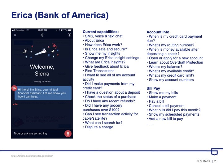
Let’s rewind. It’s 2019 and the kickoff was a perfect combination of thrill and terror. Our new Product Owner used Bank of America’s assistant, Erica as an example. He said it took a small army to launch it, and we had funding for a much smaller army. To start, we had:
1 Integration Analyst
2 Back-end Developers
2 Front-end Developers
2 Quality Assurance Testers
3 User Experience Designers
1 Researcher
1 AllY Specialist
1 Scum Master
1 fearless Product Owner
I wondered what we would call our assistant, which made me think of Erica, which made me remember a line from Stranger Things, “You can’t spell America without Erica.“ It was cheesy, but also kinda clever. He further clarified that Bank of America created a proprietary NLP engine, and we would use a company called Clinc to handle that complexity. Phew.
Competitive Analysis
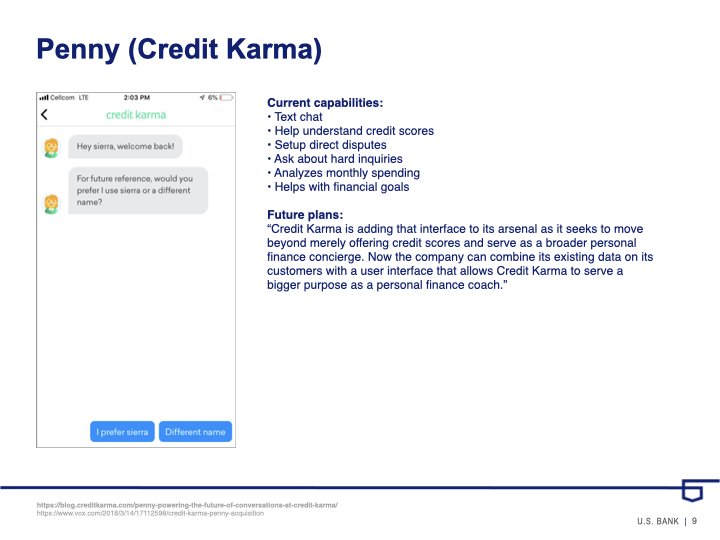
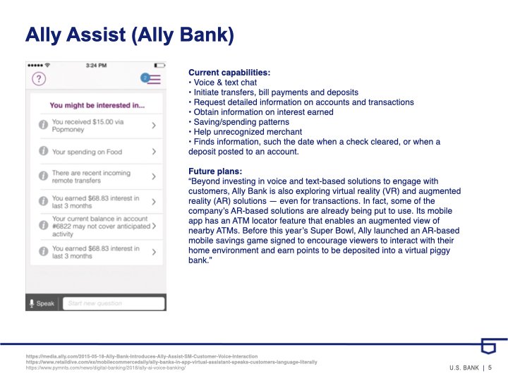
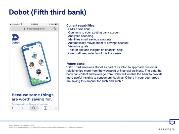
Within the first week, I opened new checking accounts with Bank of America, Ally, and Capital One. I opened new savings accounts with Albert, Dobot, Digit, and Joy.
I documented and added them all to the library. It sparked many conversations as we explored names, states, voices, personality traits, capabilities, etc.
These tangible examples gave us common language which was so important at the time. These conversations helped us articulate and align with Product and Development teams early on and create a habit of exploring the new space together.
The Product Owner would later say, “This is when I knew you were Product material.”
Customer Interviews
We started the next day by getting feedback from people outside of the team. During lunch, we went to the lobby with a single question. “If you had a banking assistant in your mobile app that could handle any banking task, what would you ask it?”
After dozens of interviews, we kept hearing the same thing, “what is my balance?“ This accounted for a lot of the responses. We were so discouraged. That’s it?
That was not it. We ran into Abby Losordo who has relied on voice technology for a long time. Her response was incredibly valuable, “Oh man, I would ask it for my recent transactions. I would tell it to pay my bills. I would ask it to alert me to possible fraud charges. I’d ask to set up my travel notifications. Oh, and I’d like to know if any credit card bonuses are available for me…” Her ability to see what others couldn’t was incredibly valuable.
Customer Mental Models
Erica was the only 1 to 1 competitor but I knew there were plenty of experiences our customers had contact with that would shape their expectations.
To demonstrate this, I remembered Jakob's law of the Internet user experience and put together this matrix to help illustrate the point.
I used tools like App Figures and grabbed screenshots of any with voice capabilities (Spotify, Amazon, Google Translate, Sephora, etc.) to begin building a visual library. It would be something tangible that the team could reference and discuss. And it was a hit.
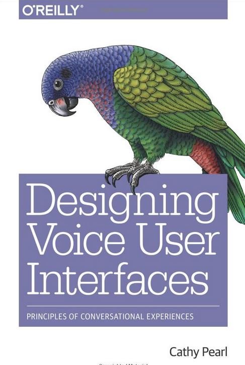
Cathy Pearl
With a lack of well-documented standards, we leveraged insights from Cathy Pearl’s book to help ground the design team. We were able to dive into topics like:
Understanding key VUI design concepts, including command-and-control and conversational systems
Visual representation
Speech recognition technology
Practical ways to test your VUI application with users
Monitor and learn how to quickly improve performance
Get real-world examples of VUIs for home assistants, smartwatches, and car systems
One insight that stuck with me was on the topic of shame. There were a couple of studies that pointed back to the same thing, humans are generally more comfortable discussing sensitive topics like financial distress, or PTSD symptoms with a bot instead of a human.
The How
Smart Assistant States
Natural Language Processing has three major states: collect, process, and respond.
Collect input
The listening state reassures the customer that they can begin to speak.
The sound detected state shows the customer what the speech recognition picks up in real-time.
The keyboard open state reassures the customer that they can begin to type.
Process Feedback
The thinking state shows the customer which utterance was captured and reassures them that progress is being made
Give response
The response state contains both a text and a visual response. The customer can control audio on or off in the settings.
What’s in a Name?
U.S. Bank research had “Betty“ as our leading Assistant name, citing that women and men preferred giving commands to a woman. Woof. I recently read an article from the Harvard Business Review that found anthropomorphizing assistants with names like Siri and Alexa were perceived as less trustworthy.
Being trustworthy was our first design principle.
So I left this article on our Product Owners desk and we regrouped as a team. I don’t love how generic Smart Assistant is but I do love that we didn’t end up with Betty.
Principles
The five that floated to the top were: trustworthy, intelligent, inclusive, simple, and seamless
To make this more tangible for everyone, we found real-world examples that we respected and wanted to emulate. So for example, let’s take seamless, we chose to model Starbucks because:
Integrates physical and digital experiences
Advanced order and pay to make grabbing coffee effortless
Real-time information across every channel
Note: there was little interest in the Assistant being human-like, we didn’t want to get into the uncanny valley.
The Entry Point Debate
This deliverable sparked a larger debate. The direction from leadership was to encourage customers to use their voice. We were asked to remove all tap affordances in favor of voice, which didn’t sit right. The phone was in your hand, customers had to press a button to activate the Assistant. It’s not like Alexa, it can’t be used from across the room. Customers should interact with us however they feel comfortable. We launched with concept #1. We’d later iterate on this after we learned that
a low amount of all interactions are voice input
a high amount of all interactions are keyboard input or tapping an option presented on the screen
The Prototyping Problem
Bank-approved tools like Sketch and Invision create visual prototypes that were used to convey visual design. On the other hand, tools like Voiceflow are used to convey voice design. We needed a tool that could do both.
All-star Visual Designer, Michael Larson, took the feedback and a long weekend then reappeared with a custom solution that could do it all. He continued to evolve the tool based on our feedback introducing features like ninja mode, custom voices, and earcons. It changed how designers and developers worked together at the bank. But that’s a story for another day. Ultimately this allowed us to get user feedback and iterate quickly.
Bill Pay User Flow Sample
When we design our approach was to think of scenarios from broad to narrow.
What is the most vague utterance a user could give that would trigger this competency? What is the most specific utterance that would fill every required slot that would leapfrog them to the end? Then we work on everything in between.
“Pay my bill”
”Pay my bill on Friday”
”Pay my Xcel bill from my checking account”
”Pay the minimum amount due”
“Actually, change the amount to the statement balance”
“Pay $150 on my credit card on the due date”
Bill Pay Wireframe Sample
Annotated wireframes helped us mitigate risk with our legal team early on. It aligned us on conversations with the A11Y and FED teams. Since the bones of the assistant were done, my focus over the next year would be building out more functionalities. I worked on competencies like account/routing, balances, bills due, banker help, deep links, internal transfers, onboarding, Zelle payment and status, account opening, interest rates, card on/off, add recipient, card replacement, payoff, bill pay, intelligent routing, unknown transaction, suspected fraud, and transactions.
The Voice Sumit Conference
Remember the voice-first vs. multimodal debate we had internally? My A11Y partner, Carissa Merrill, and I built a compelling case and successfully changed the direction of our project. We submitted our points to the largest voice-first (ironically) conference in the United States. And they invited us to their main stage in the form of a panel discussion.
The panel conversation reiterated the importance of designing for diverse user base to make a robust products.
Cathy Pearl from Google, who quite literally wrote the book on Voice Design, reiterated the importance of our conversation. This opened up the door for other opportunities to speak on behalf of the bank on for the VUX World Podcast, Finovate, AI4, Women in Voice, etc. Here is an early example of our talking points.
The Launch
Soft Launch
After a couple of months of working remotely, we were still on track for launch. We started with an employee pilot and after some minor tweaks, we began the throttled release to production. Here are some highlights from August 19th with the feature available to about half of customers.
Assistant Engagement:
~20,000 unique users
~30,000 sessions
~75,000 utterances
~75% intent accuracy
Full Throttle
We celebrated the release from home instead of the office. It wasn’t how we’d imagined this day, but it was a sign of the times. The pandemic would further prove the need for an Assistant. We saw a dramatic influx of questions and were able to use that data to help facilitate unprecedented call volumes.
The team has almost doubled in size from kickoff. After launch, we would break into micro teams with slightly different focuses. Later, we would double again as we expanded to online banking and .com spaces.
Talk To A Human
We knew that the assistant couldn’t tackle every question to start, so if we couldn’t help them, we’d offer to hand them off to a representative who could. Our first iteration was to send everyone to the generic 800 number. In the next iteration, we created a competency that would allow us to collect and understand the issue and if it’s associated with a specific account.
We tested one flow that started by collecting the account and another concept that started by collecting the topic and here is a sample of learnings.
Customers would give additional information if they knew it would allow them to leapfrog into the experience.
There was confusion around how we structure data internally which creates external confusion, and an example of this was what we consider to be account-related.
Participants were confused by language around bankers, representatives, etc.
Product Inovation Hour
I created a lunch and learn team meeting to prioritize curiosity, experimentation, and collaboration beyond the day-to-day work. We dedicated an hour per month and I facilitated the discussion, the engagement and feedback were overwhelmingly positive.
Here is a sample deck from the kickoff meeting in January of 2021 where we discussed multilingual assistants, see full deck.
Asistente Inteligente
In April 2022, we launched the first Spanish-speaking assistant in banking.
“Sometimes language can be a barrier to accessing best-in-class financial services, and U.S. Bank is focused on eliminating barriers. Asistente Inteligente is an innovative first-in-the-industry technology, which shows Latino and Hispanic Americans that we’re here for them. They can confidently ask questions in their preferred language with this new financial tool.”
-Ramiro Padilla Klein, U.S. Bank vice president for Hispanic segment strategy
The Transition to Product Manager
Data Analysis
I started by diving into data analysis and visualization tools to spot patterns and derive insights that drive data-informed decisions.
Quantum Metric allowed us to isolate and replay specific sessions
Adobe Analytics allows to monitor user journeys and dropoff.
Qualtrics allowed us to collect feedback from customers directly.
Tableau allowed us to understand what questions are asked and how they change over time.
Sales and Growth Strategy
During a late-night data dive, I noticed growth opportunities that were sliding right past us. Generic utterances like “certificate of deposit” were trained to go to balances but some of these customers didn’t even have one. What if they were looking to open a new product?
To test this, we added some simple logic and a disambiguation page giving the customer 3 options. We found that almost half of the customers chose the shop option.
“Sales and Growth strategy, Sierra implemented multiple experiences focused on Deposit account opening, implementing user-specific rate quotes and pricing, and deeper linking to drive top-of-funnel sales opportunities resulting in 500K sales and growth referrals (333% above target:150K).”
-Product Manager in my 2023 year-end review
Personalization Strategy
Left to right we have the Smart Assistant Landing Page sample from my own account for each year it was in production. In September 2022, my first move was to make the suggestions tapable and immediately doubled and tripled engagement for the competencies we displayed. Not only did we see the immediate spike in engagement, but those numbers have held steady ever since.
Then we leveraged product mix analytics to determine which shortcuts a customer would see based on their accounts. Then we added customer-specific information, like account nicknames to make it more conversational. Then we layered in suppression after the action was taken to show the next best shortcut.
“In 2023, these efforts resulted in organically driving 3MM completed transactions which accounted for 26% of Smart Assistant overall completed transactions, and overall achieved 11.4MM Transactions completed on mobile (167% above target: 6.8MM).”
-Product Manager per my year-end review
Shortcuts Expansion
The success allowed us to expand placement.
The landing page displayed shortcuts by product mix logic.
The search bar displayed shortcuts with the highest engagement logic.
Inpage help displayed shortcuts based on where you are in the app.
End-of-flow displayed shortcuts based on what we know customers commonly do next.
DIY and Servicing Strategy
Utterance analysis showed customers have tons of questions about the status of their Zelle payments, so we created an experience to give them a straightforward answer and curb calls to the call center.
“DIY and Servicing strategy: Sierra implemented ~20 features and enhancements resulting in digital containment for 266K sessions, including key experiences such as Zelle Activity Status, External Account Linking, Direct Deposit Enablement, and Login and Password Troubleshooting, which otherwise were provided help content and strong potential for escalation. “
-Product Manager per my 2023 year-end review
Platform Expansion Strategy
As I transitioned from UX to Product Manager, I spent a lot of time with the REACT team to achieve parity for the online experience launch. This expansion gave us rich data to compare and contrast. We were able to identify questions that were specific to the platform and authenticated vs unauthenticated.
Pictured is a sample from U.S. Bank.com
Customer Feedback Strategy
We added a “was this helpful, yes or no” kind of question in the UI to start identifying issues quickly. This gave us a breakdown by competency for customers who answered no.
Upon release, we were floored to see that only 40% of customers thought it was helpful. It just didn’t make sense. So I spent the first couple of weeks watching replays in Quantum Metric and caught three major defects. Just by fixing those three defects, we saw the numbers rise from 40%-72%
Once that was figured out, we could drill down into feedback by competency. This allows us to identify and remedy issues quickly. These findings helped inform our 2024 roadmap prioritization.


